Doing your portfolio can become a nightmare. There's just too much to do.
We can get stuck because we don't know how to plan the execution, or we feel that something is missing but we don't know what it is.
In the process of applying to grad school, I had to make several versions of my portfolio, according to the specific requirements of each institute. They varied in the number of projects, format and focus areas. So I had to rework a lot of things, but always making sure I met the deadline.
Here are my top tips from going through the grueling process myself, and doing a lot of research on the topic:
Provide more weight to certain aspects of your work over others, depending on the role or area that you are applying to.
Place the most relevant work in key areas. When choosing the order of your projects, I would recommend to especially start strong and finish strong because of the “serial position effect”, the brain's tendency to remember first and last, above information in the middle.
Lots of portfolios only show final visualizations, which can be impressive, but don't limit yourself to renders.
Instead, take the opportunity to showcase your different skills. Show hand-drawn sketches, progress shots, quick WIP models, renders for internal design review, etc.
Take the viewer step by step through your process, at least in one project of your portfolio.
Now that you have your process in mind and skills you would like to show, choose the projects and the material you're going to use according to the extension/layout of the portfolio.
That will be your focus. No more.
Then, focus on fixing all the details you can improve in a reasonable time (it's dangerous to get stuck in here forever) to make it the best possible.
Clean up your sketches, do extra post-production, and always use photos with good resolution.
As resources, I can recommend Youtube channels like Alex Hogrefe's and Show it Better, which have pretty cool tutorials to make your graphics stand out.
When you're writing about the project, think about what made it special. Was it something about the client or the location? Was there an important challenge that you had to solve in mid-process? How did the project impact you?
Storytelling is fundamental. Prioritise words and imagery, and focus on the vital moments of the project that make it interesting.
Overall, think about how to craft a project combination that tells the most compelling story about you, and don't be afraid to bring your point of view to the table while you do it.
What were your responsibilities? Who did you collaborate with?
Always give credit to the people that formed part of your team and don't make things up to make you look good. Honesty is always the best policy.
Fonts are not the way to get yourself attention. Your designs are. Your type should be readable while keeping an aesthetic layout.
Below some pretty helpful tips on the basics from The Portfolio Handbook, an awesome manual by the UCID Class of 2012.
Safe typefaces and typefaces to avoid. The Portfolio Handbook. P. 37 (2012)
Mixing typefaces. The Portfolio Handbook. P. 36 (2012)
Leading, kerning, tracking and contrast. The Portfolio Handbook. P. 38 (2012)
Measure and rag. The Portfolio Handbook. P. 39 (2012)
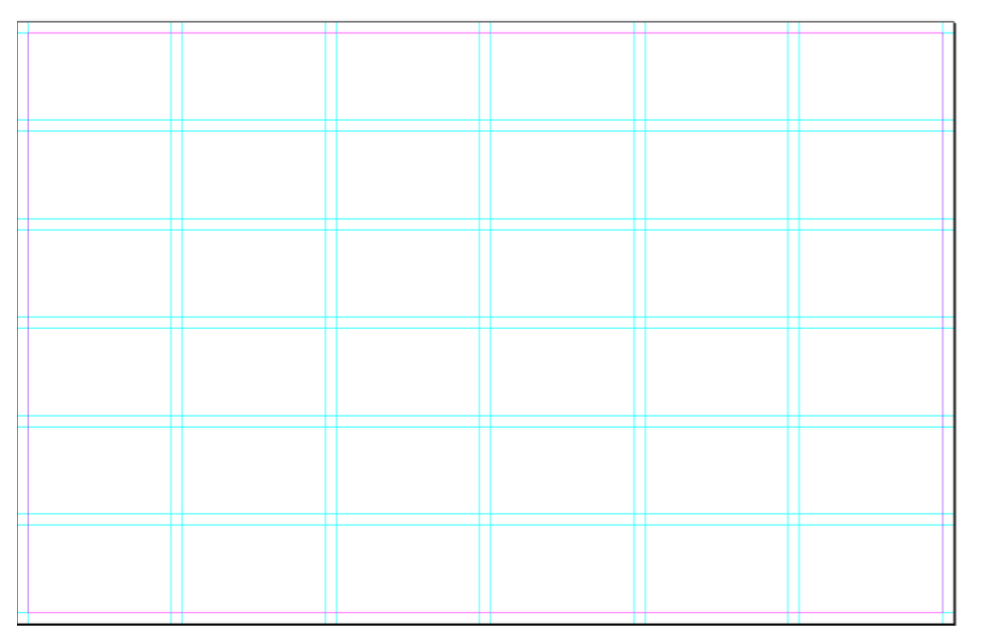
Speaking of software, Indesign is definitely what you should be using. Using their grids feature can help you create a consistent layout.
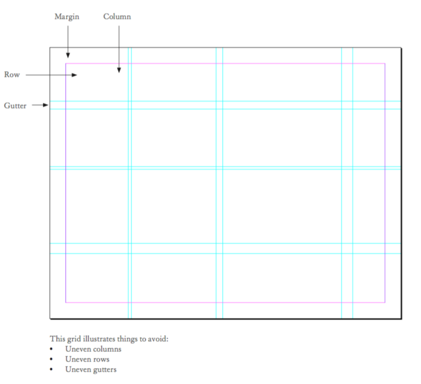
The margins, structure, and proportion of a page say a lot about your graphic skills. Let your images breathe and don't overload the pages to make it look more full. The more concise and attractive your layout, the better.
Here is an example of what you shouldn't do:
And what you should do (example of a clean 6x6 grid):
Things to avoid vs. best practices. The Portfolio Handbook. P. 32-33 (2012)
If an institute is checking hundreds of applications, naming your file correctly can make their work much easier.
You can use something like “Firstname_lastname_institute”.
You don't have to put everything you've done in your portfolio. If it's in there, people will see it, and could ask for the same type of project to be done for them. It's supposed to be there for a reason.
You have to selectively project what you really want to focus on in your work, to attract future clients in those areas.
10. Know your audience
Always keep in mind who your audience is. Your portfolio should give an idea of what you can do for them. Are they a corporation? A consultancy? A research laboratory?
What you show should be aligned with their vision and projects.
Now for one last advice, I'll focus on you. Your portfolio has to project who you are and give a glimpse of your unique qualities and skills.
Give your reader a sense of your motivation and values, what you enjoy working on and what value can you bring to the team.
And that my friend, can be a complicated thing to do if you are not sure of what those things are. Self-awareness is a fundamental trait that you can start building now.
According to research those who understand their natural behavioral preferences are far more likely to pursue the right opportunities, in the right way, at the right time, and get the results they desire.
So, if you are interested in getting to know yourself a bit better you could take this behavioral style and values test called the DISC Profile, which takes about 15 minutes to do, and is free and fun to read.
It helps you understand how you prefer to get things done, and why you're motivated to do them. You could even share it with your close ones to get their opinion, which is really helpful too.
4 components of the behavioral style test - DISC Profile.
I know it's a lot of information to digest so I'll leave it here. I just wanted to give solid advice on several areas that are involved in making your portfolio. Once you have the information it's easier to get things moving.
Put yourself a deadline, work hard and then you can always improve things later as new projects appear. Work with what you have.
If you have any questions or want me to check your portfolio just reach out below in the comments and I will be glad to help.
Good luck!


