Have you ever struggled to complete a design project on time?
Or perhaps felt that a tight deadline stifled your capacity for maximum creativity?
I surely have, and the book Creative Workshop, which I have mentioned in earlier posts, is all about building skills to face this constant battle we have as designers.
"Creative Workshop: 80 challenges to sharpen your design skills" cover
Not having all the time we would like to finish a project is something that happens on a day to day basis in our practice. Learning to be smarter about the way we use the time we actually have, and taking advantage of our constraints can lead to more creative results.
Creativity is something we can practice.
There are some key ideas I have learned in the course of this book (I still have dozens of exercises to do, but the discoveries have already been insightful):
We radically improve our skills when we are forced outsite our comfort zone and asked to solve problems that seem foreign.
Process is more important than the final product.
“Being process oriented, not product-driven, is the most important and difficult skill for a designer to develop.”
Failure is a necessary component of creativity. Improving as designers will inevitably present difficulties, and what gets us to succes is resilience.
We can become more intuitive by solving wildly divergent design problems in a disciplined manner.
Creating on a constant basis is what makes us improve.
Because it's easier said than done, not only I want to encourage you to put out imperfect work. I'll actually show you the process behind my exercises, even though I feel uncomfortable doing it as well.
Especially with most of these coming from unexplored design disciplines for me.
“Improvement isn’t magic; it’s the result of a sea of imperfect work created over time.”
This week's challenge was around advertisement and time.
Basically, the idea of the activity was to select an ad from before 1980, and to adapt it to contemporary style through a quick intervention .
Total time: 90 minutes
Ad / project research (15 min):
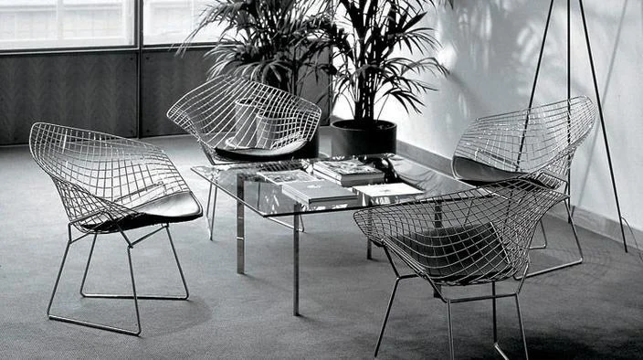
My selection was built around furniture design, specifically featuring Harry Bertoia's classic Diamond Chair, since his wire chair collection is among recognized achievements of mid-century modern design.
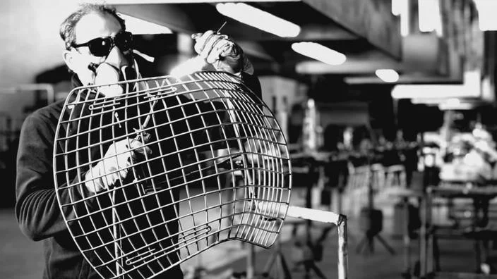
This piece in particular, was designed between 1950 - 1952 by Bertoia, and began to be fabricated by Knoll since 1953 until the present. Bertoia was certainly a pioneer in manufacture with wire, supported by his background of metallurgy workshops in Cranbrook Academy.
The chair is constructed from welded and curved wire rods with a vinyl or chrome plating. The artist's designs not only responded to the functional demands, but to an aesthetic purpose that led him to explore forms and volumes as if ithey were a sculpture.
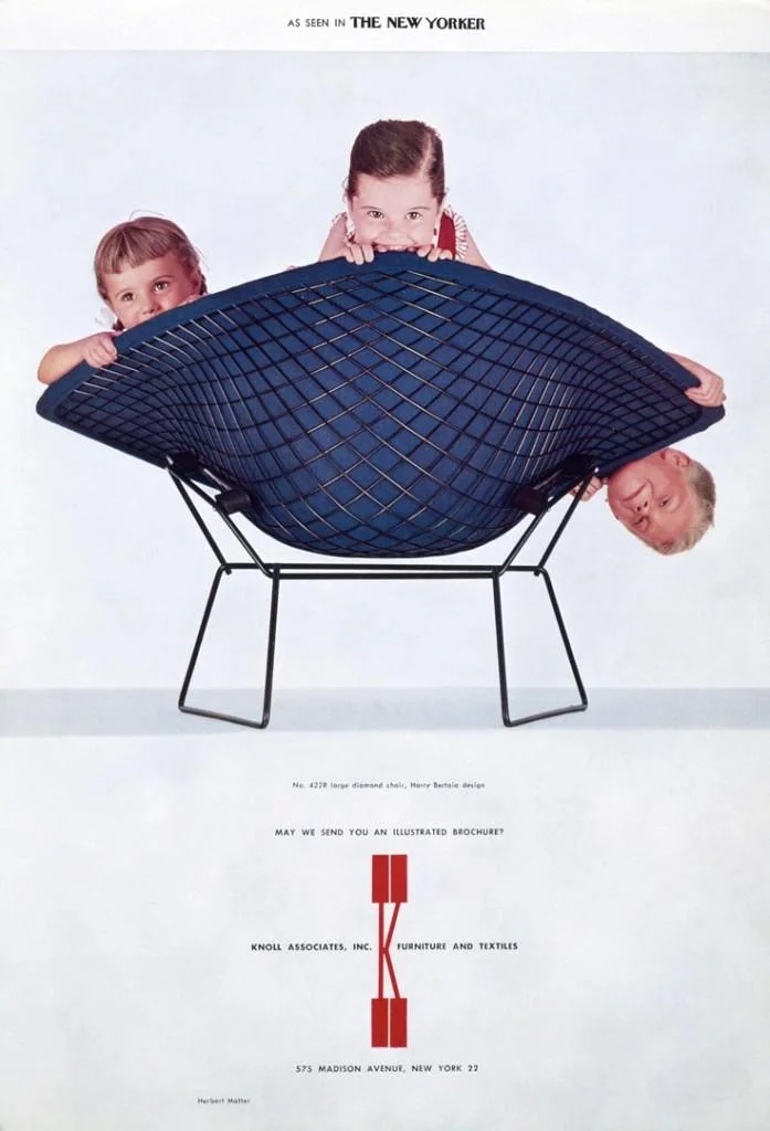
The production of the chair was carried along with advertisement campaigns to promote its original and avant-garde design, from which I made my pick for the exercise:
Knoll Ad 1957 - Herbert Matter
By way of background, the ad was made by Herbert Matter, a Switzerland-born designer/photographer hired by Florence Knoll in 1946 to revamp the Knoll public image.
His influence, particularly his style of layering graphic elements to create a photo-montage appearance, has had lasting effects on modern day graphic design.
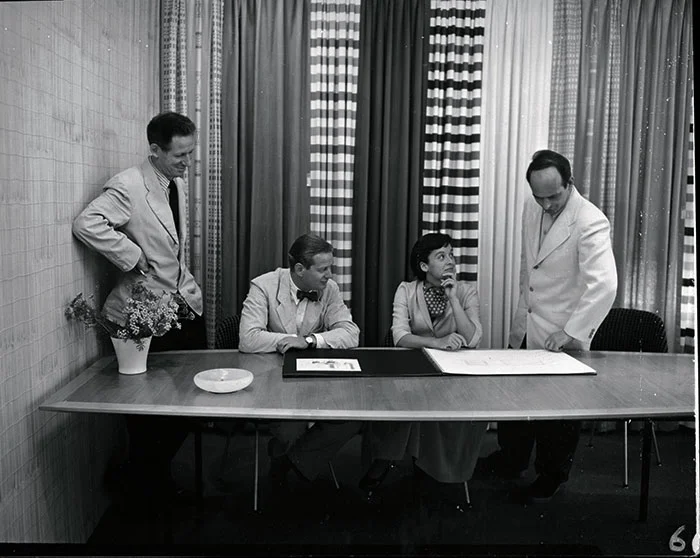
An early 1950s photograph of Herbert Matter, Hans Knoll, Florence Knoll and Harry Bertoia.
Sketching (15 min):
After a couple of drawings, this was the sketch synthesizing the main ideas:
Intervention (60 min):
The intervention of the ad looked for a simple minimalistic approach, that delivered a contemporary renovation in the set time.
The renovation was built on the following elements:
White background
Update of the Knoll logo design
Sans-serif fonts
Shift from black and white images to bright colors for a bigger contrast and a modern look
A key point in this activity was the importance of adapting to the language of time.
Design can be classic and atemporal in some greatly accomplished products, but generally, its result is very clearly related to the period of history in which it was made, giving an image of how tastes and social behavior have changed over time.
Playing with this reality of design and time is an alluring idea, especially considering the theory of history being cyclical.
- What old concepts can be brought to contemporary times?
- What were the challenges and needs of the moment?
- Which new challenges and needs can be detected?
I will leave those questions open to you.


